Ok here is the delivery of the 23rd snippet sharing and I hope that it will enable you to be a better presenter with these tips. Let’s take a look at the recommendation made Guy Kawasaki, an entrepreneur , author and marketing specialist.
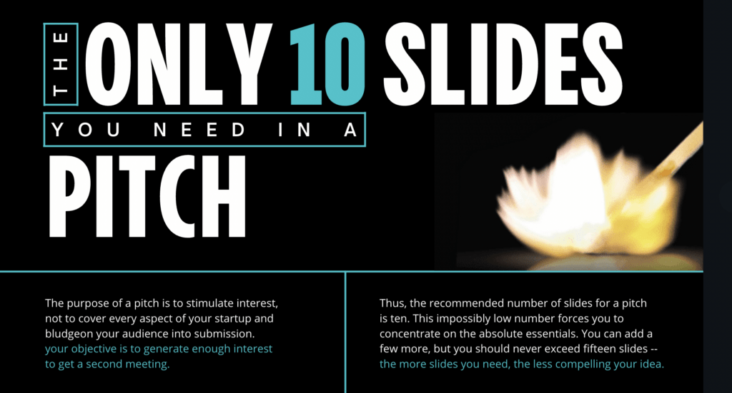
According to Guy, a pitch should have ten slides, last no more than twenty minutes, and contain no font smaller than thirty points. This rule is applicable for any presentation to reach an agreement: for example, raising capital, making a sale, forming a partnership, etc.
Ten slides. Ten is the optimal number of slides in a PowerPoint presentation because a normal human being cannot comprehend more than ten concepts in a meeting—and venture capitalists are very normal. (The only difference between you and venture capitalist is that he is getting paid to gamble with someone else’s money). If you must use more than ten slides to explain your business, you probably don’t have a business.
Twenty minutes. You should give your ten slides in twenty minutes. Sure, you have an hour time slot, but you’re using a Windows laptop, so it will take forty minutes to make it work with the projector. Even if the setup goes perfectly, people will arrive late and have to leave early. In a perfect world, you give your pitch in twenty minutes, and you have forty minutes left for discussion.
Thirty-point font. The majority of the presentations that I see have text in a ten-point font. As much text as possible is jammed into the slide, and then the presenter reads it. However, as soon as the audience figures out that you’re reading the text, it reads ahead of you because it can read faster than you can speak. The result is that you and the audience are out of synch.
You can use and improvised his presentation technique from the link here. Download and keep it as it is very useful and easy-guide-to-adapt – https://www.canva.com/design/DAEhUeYe_fo/view?utm_content=DAEhUeYe_fo&utm_campaign=designshare&utm_medium=link&utm_source=viewer

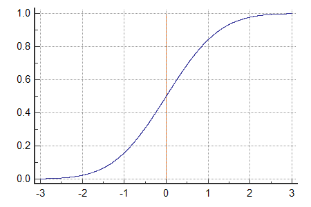
For talks, I use the half bell curve approach. In applying this technique I would have about 18 to 20 slides for an hour of presentation duration. 6 slides for 20 mins and 1 slide break followed by another 6 slides for another 20 mins with 1 slide break. 3x cycle. This is because human attention span can only cope about 20 mins of input/listening before the retention rate gets affected.
Applying in the context of the half bell curve, the first 20 mins means building up the case, getting the audience to do 3As – accept you, adjust to you and agree with you. The second 20 mins is for you to do 3 Cs – capture their attention with your content, convince them on your proposition and commit them to your recommended course of actions. The third 20 mins is for 3Bs – believe that your ideas will best suit their needs, brimming with the outcome of who they wlll be, and buy your offer now and then (later is the new never). Hence the ‘mood’ must end on a high and not on a downslide. A yes is secured when the sentiment is at the highest. You will lose traction and interest if you cool down and give room for contemplation. Which is why you can see most successful motivational speakers do their upselling while at the peak and not allow for the atmosphere to peak down. Your presentations should end with your bell curve reaching the highest end of the chart. In other words, end at the climax, close at rush.


